ART DIRECTOR, SENIOR GRAPHIC DESIGNER, ILLUSTRATOR.
With over 10 years of experience, I’ve had the opportunity to work on a number of incredible projects that have allowed me to grow and establish myself within this competitive industry. My skills range from Digital, Print, Experiential to Motion Design.
I hope you’ll enjoy viewing my projects as much as I enjoyed working on them.



BRANDS I HAVE WORKED WITH







WHAT I DO
BRANDING
Brand Identity
Art Direction
Integrated Campaigns
Guidelines
DIGITAL
Web Design
Motion Design
Video Editing
Social Media
TOOLS
Adobe Creative Suite
Sketchup
Microsoft Office
Powerpoint
MORE PROJECTS
Campaign Concept, Packaging, Illustration & Integrated Creative
01. The Brief
To develop a distinctive creative direction for Playboy’s fragrance portfolio,
creating identities and campaign assets that would give individual products
their own personality while remaining recognisably part of the wider Playboy
brand.
My work spanned campaign key visuals, packaging, illustration, retail POS,
social content, digital assets and motion, creating an integrated visual
presence across both the fragrance and Body Mist collections.
The challenge was to balance Playboy’s established brand recognition with a
younger, more contemporary visual language capable of connecting with
different audiences, personalities and fragrance occasions.
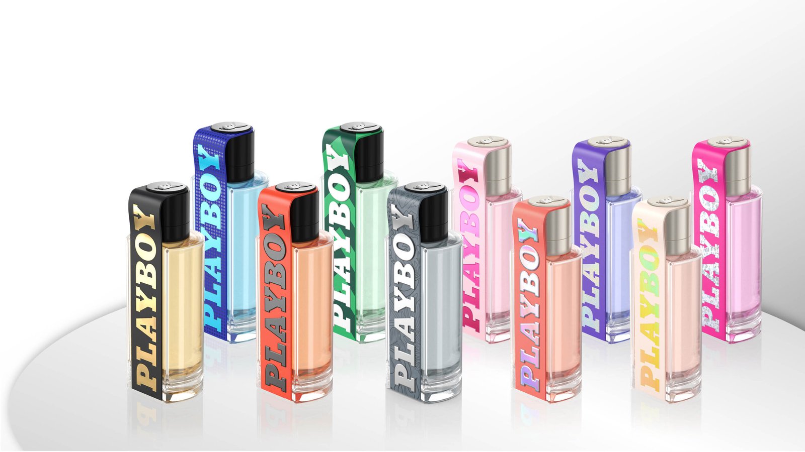
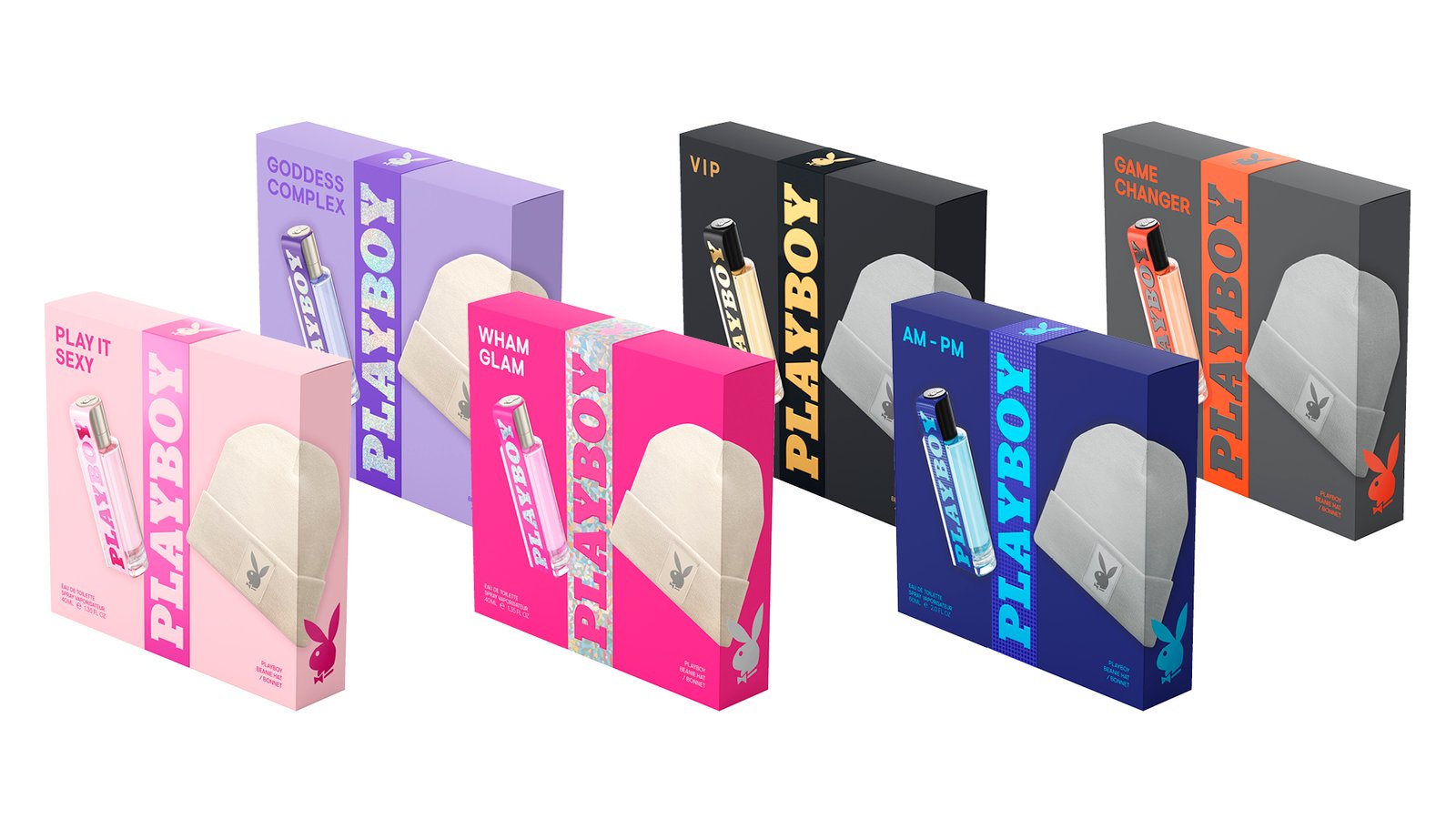
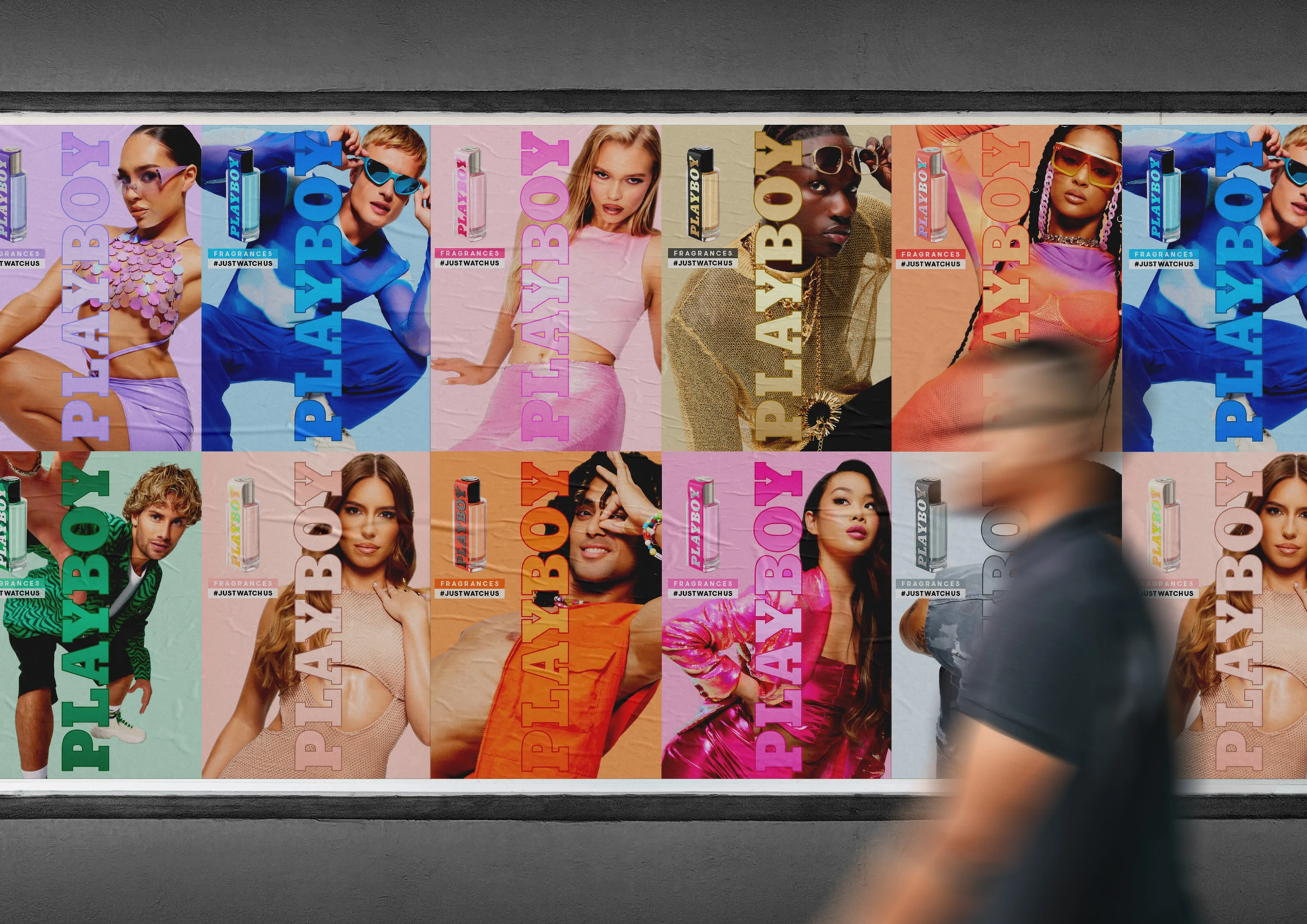
02. Fragrance Campaign & Art Direction
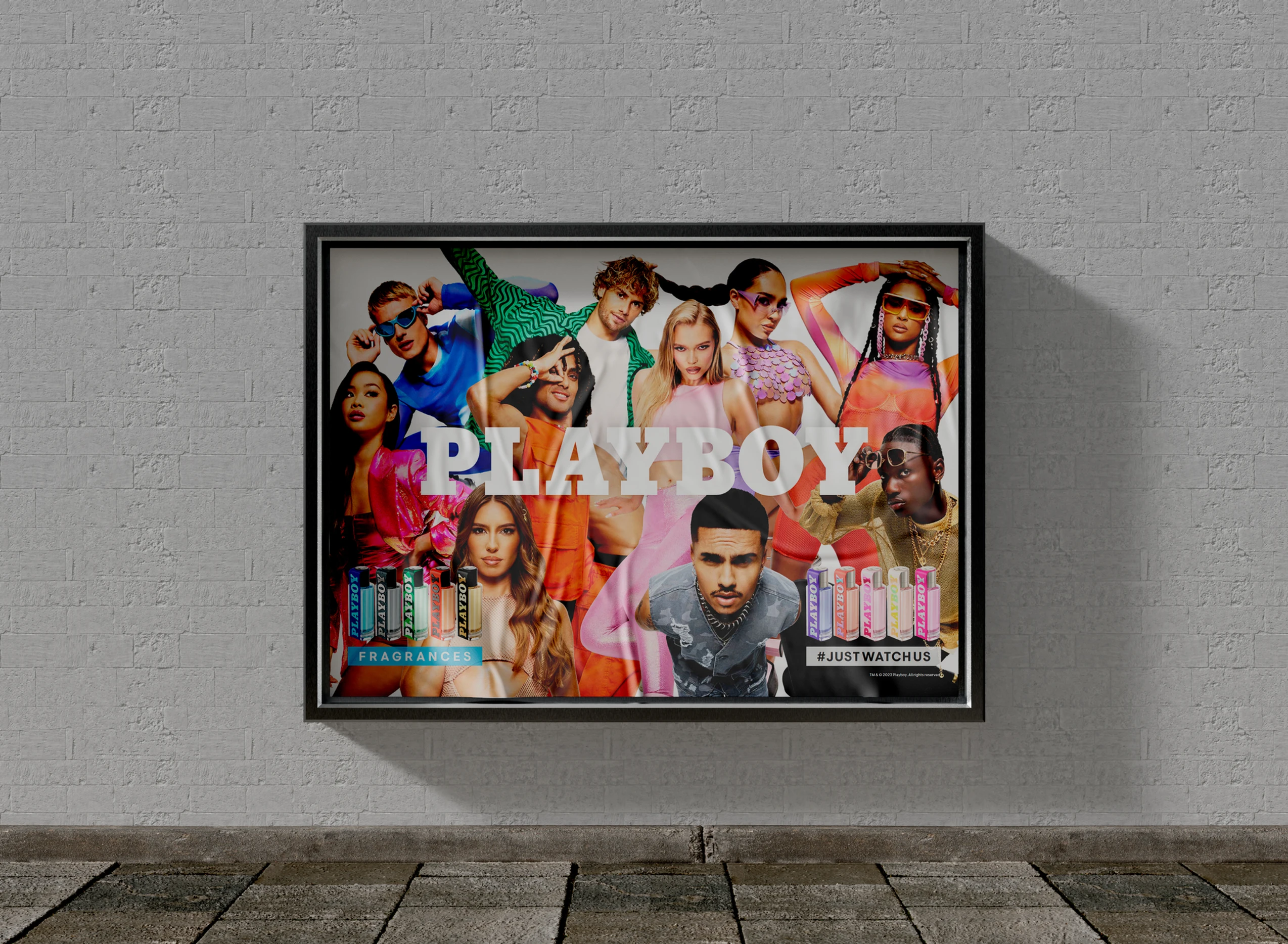
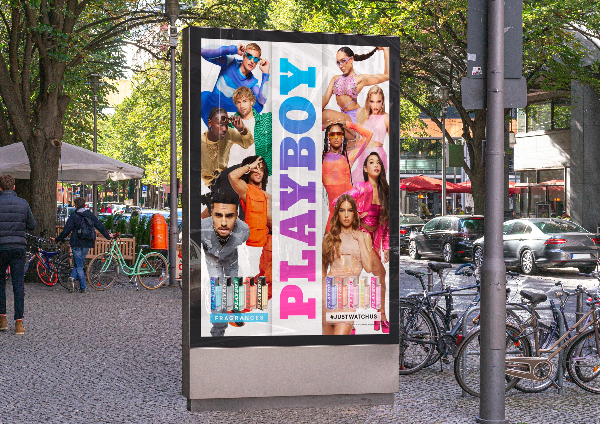
The fragrance campaign was built around the idea that different scents
represent different personalities, moods and attitudes.
I developed a series of campaign key visuals, giving each fragrance its own
visual world through art direction, colour, imagery, typography and composition
while maintaining consistency across the wider collection.
Rather than applying one visual treatment across every product, I used the
individual fragrance personality as the starting point for the creative, allowing each execution to feel distinctive while still belonging to the Playboy portfolio.
This created a flexible campaign system that could translate across digital,
social and retail environments, with the product remaining the central focus
of every execution.
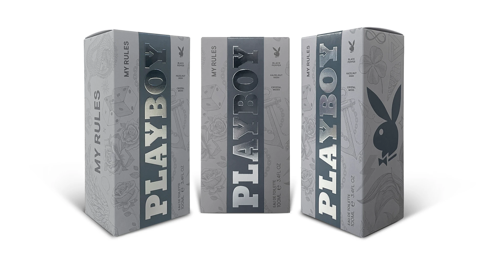
03. ‘My Rules’ – Packaging & Illustration
For the launch of Playboy My Rules, I took a more illustrative approach to
communicate the fragrance’s rebellious, provocative personality.
I created a collection of bespoke tattoo-inspired illustrations, with individual
symbols carrying their own meaning before being combined into a repeat
pattern across the packaging.
The illustration became a defining element of the product identity, giving My
Rules a visual language that felt bold, expressive and intentionally different
from the wider fragrance portfolio.
This project allowed me to combine concept development, illustration,
packaging design and brand storytelling, taking the creative idea from initial
direction through to the finished product.
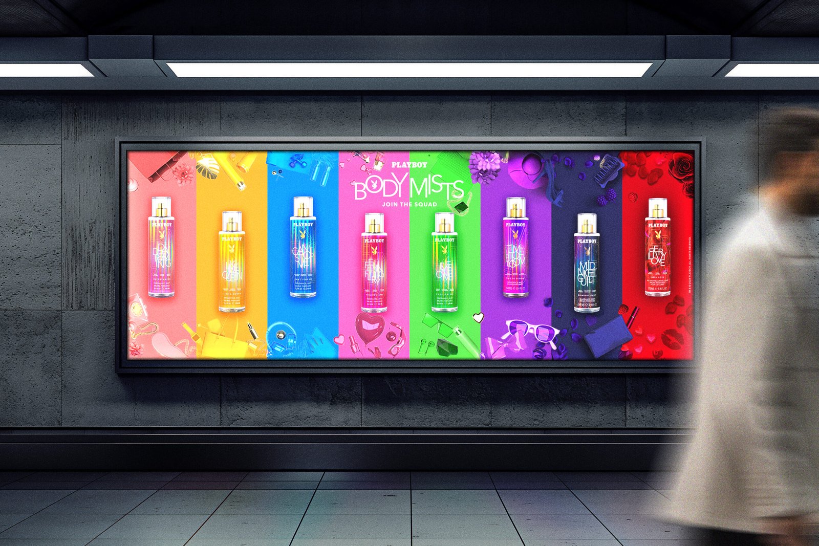
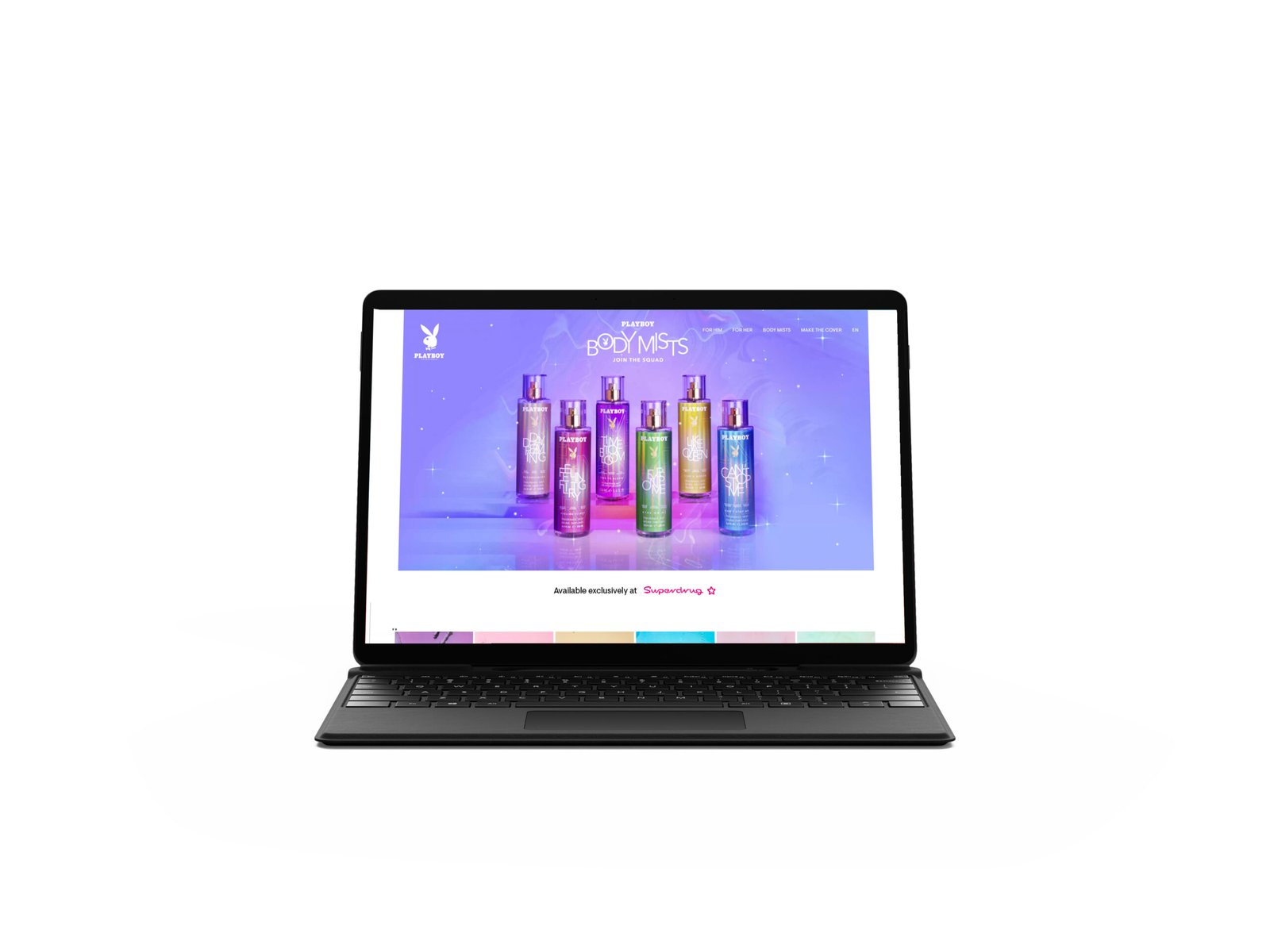
04. Body Mists – Packaging & Youth-Focused Creative
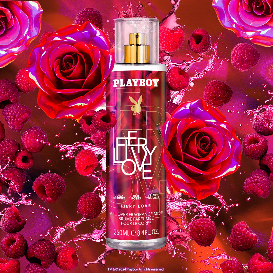
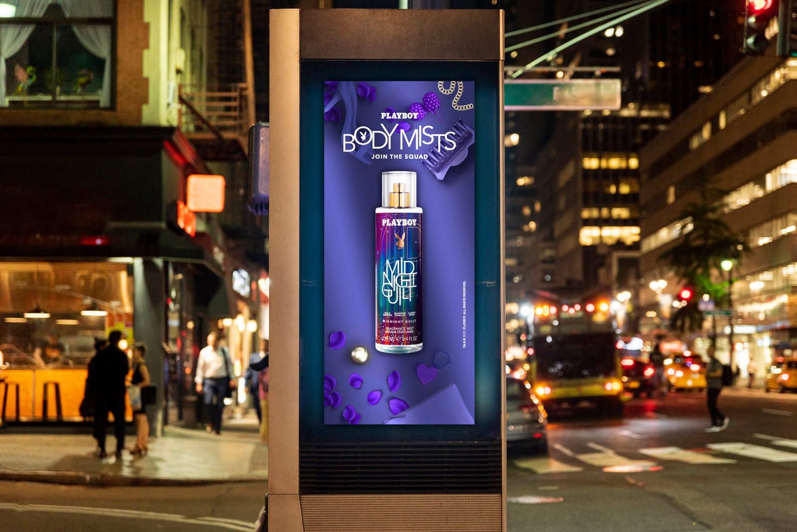
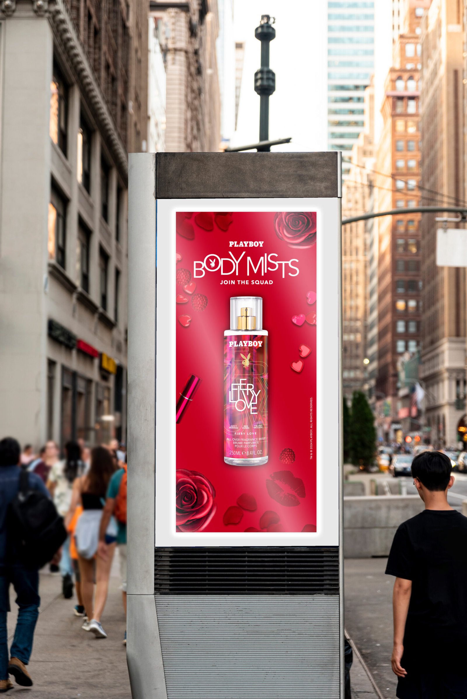
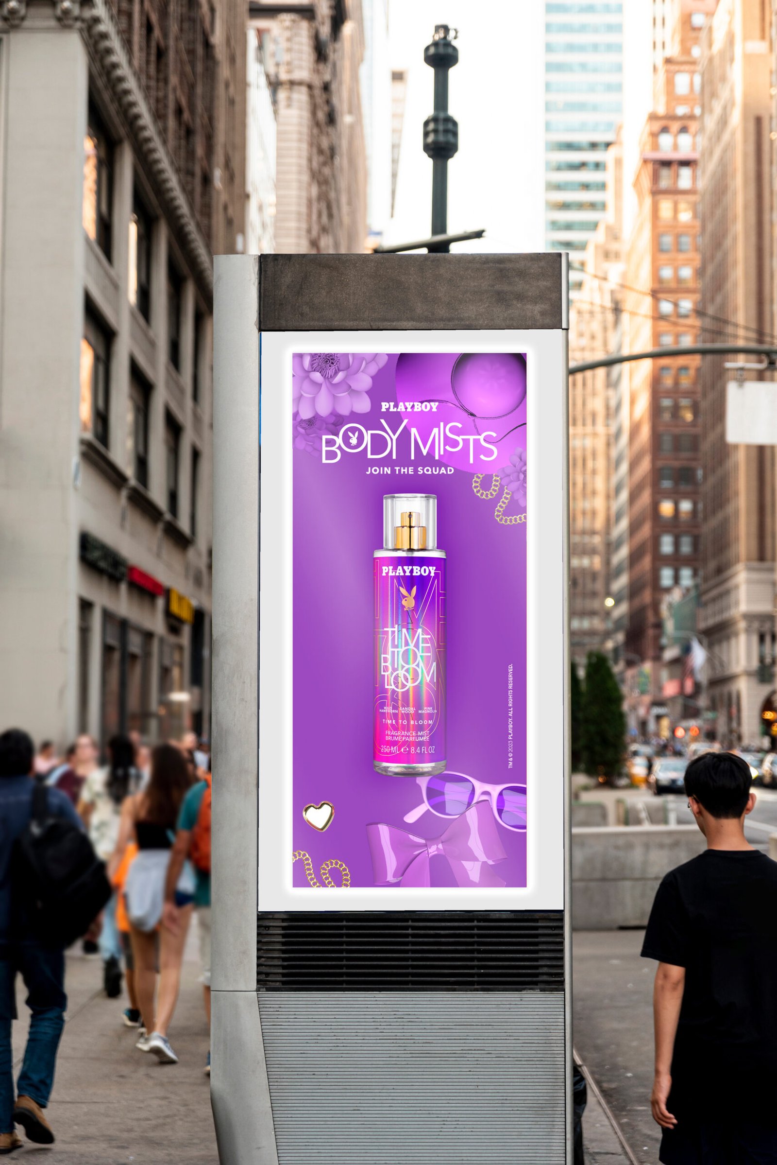
For the Playboy Body Mist collection, the creative direction shifted towards a
more playful, vibrant and youthful aesthetic, designed to appeal to a younger, digitally engaged consumer.
I developed the holographic packaging and label direction, using iridescent finishes, bold colour and contemporary graphic treatments to give the range stronger shelf presence and create a visual identity that could extend beyond the packaging itself.
The holographic language was subsequently translated across campaign
imagery, digital advertising and social content, allowing the physical product
and communications to feel part of one cohesive brand world.
05. Social, Motion & Integrated Rollout
To bring the Body Mist identity to life beyond static packaging, I extended the campaign across social-first content and motion, including promotional
animation showcasing the new holographic aesthetic.
I considered how the identity needed to behave differently across packaging, retail, Instagram, TikTok, Facebook and animated content, adapting hierarchy, product scale, movement and composition while retaining the same recognisable visual language.
This transformed the work from a packaging exercise into a broader integrated
consumer campaign, connecting product, brand and communication across
multiple touchpoints.
Campaign Concept, Visual Identity & Integrated Creative
01. The Brief
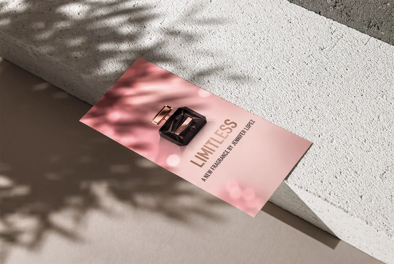
To conceptualise and create the full campaign visual identity for the launch of Limitless by Jennifer Lopez. Starting with the fragrance and its positioning, I was responsible for defining how the campaign should look, feel and communicate across multiple customer touchpoints.
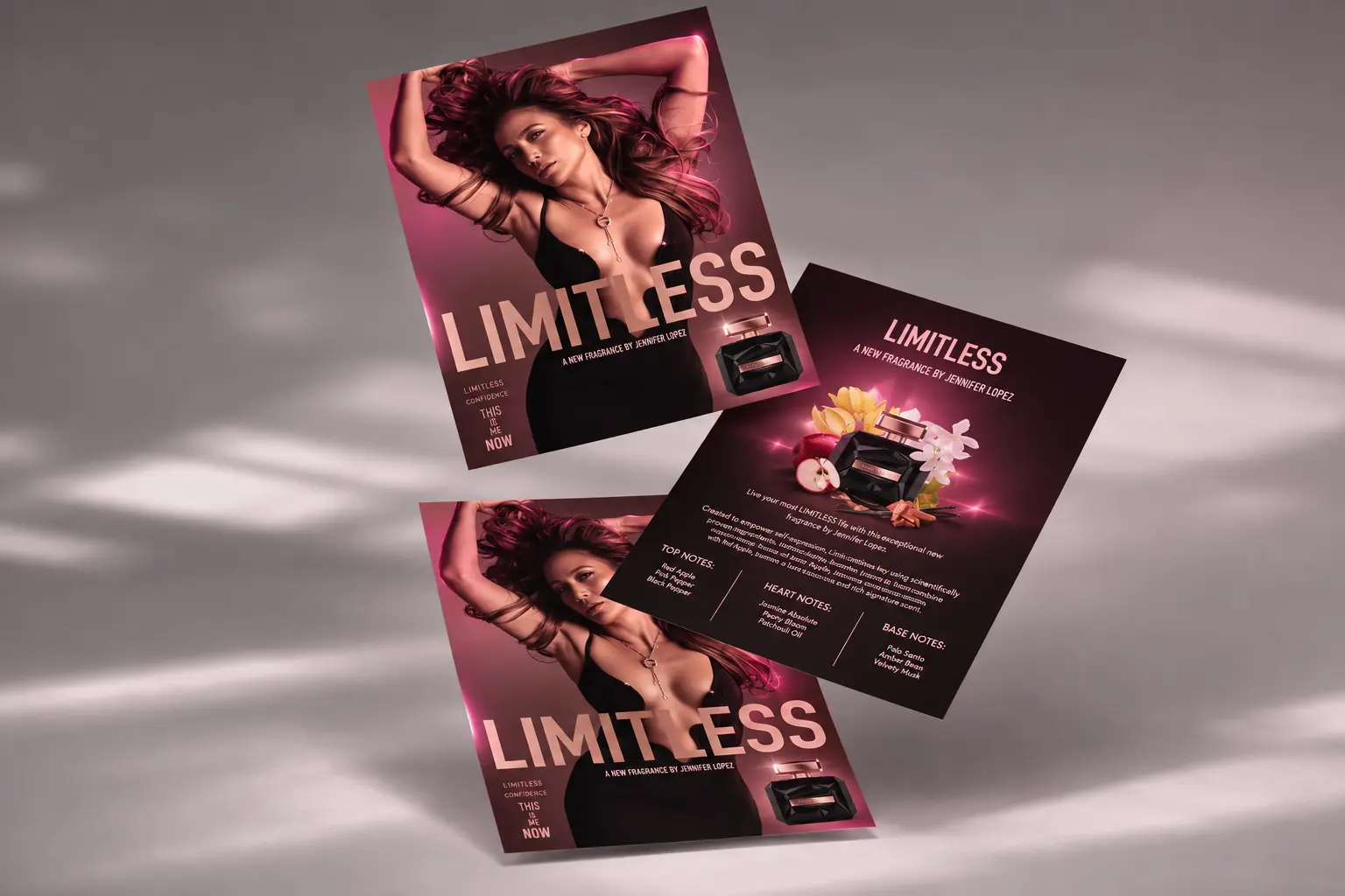
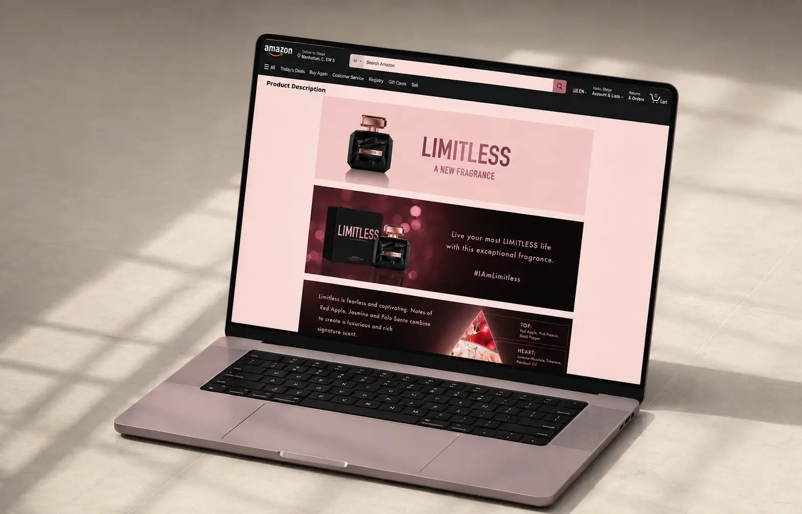
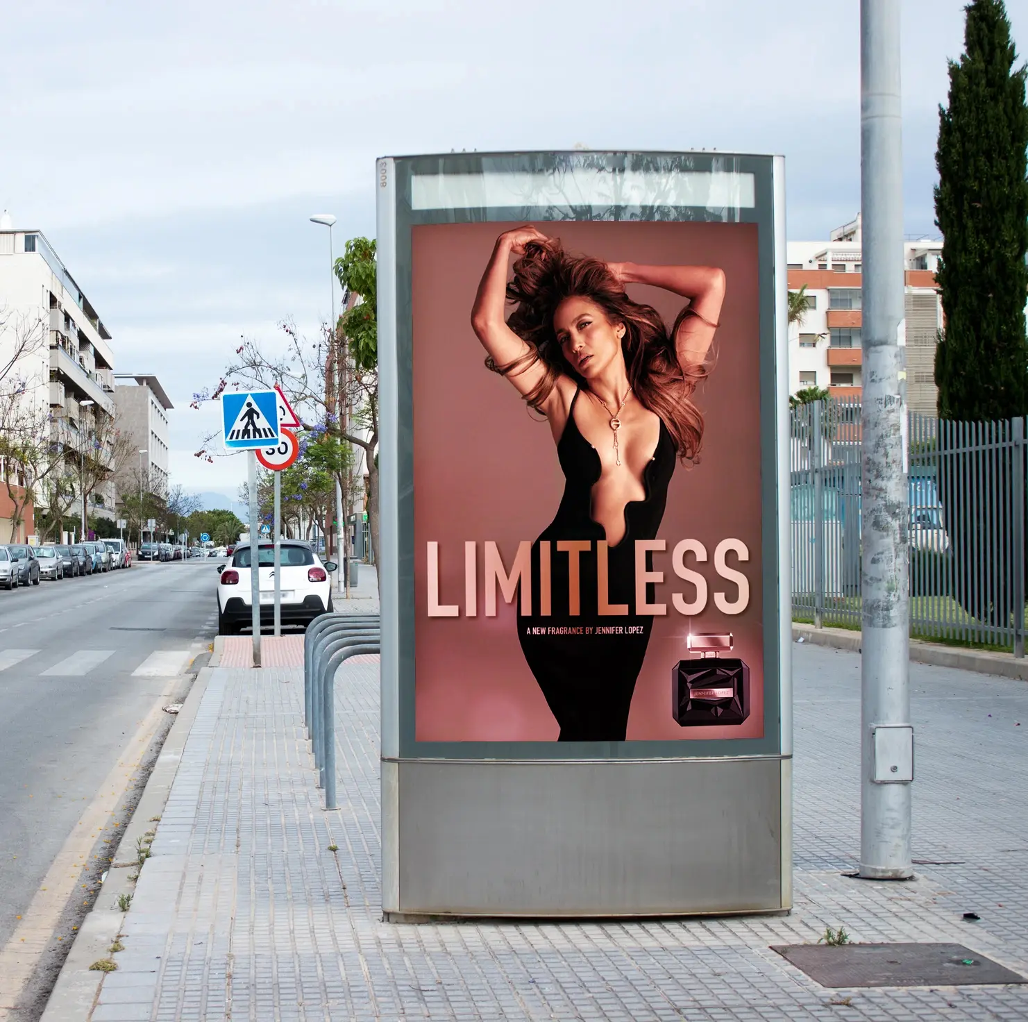
The initial hero campaign visual became the foundation for a wider integrated campaign, subsequently rolled out across Amazon A+ content, digital assets and POS, creating a consistent visual language for the fragrance launch.
02. Creative Concept & Art Direction
The creative direction was built around the meaning of “Limitless” – confidence, ambition, empowerment and the freedom to be unapologetically yourself.
I developed a premium visual world using the fragrance’s distinctive black packaging as the starting point, establishing the campaign’s colour palette, combining hot pink and red tones, typography, imagery, composition and overall art direction.
The result was a sophisticated identity that positioned Limitless as more than simply a fragrance. The campaign communicated an attitude and aspiration, while ensuring the product remained at the heart of every execution.
03. Creating an Integrated Visual Identity
Rather than designing individual assets in isolation, I created a flexible campaign system that could be translated consistently across different channels and formats.
The hero visual established the overarching creative direction, which I then adapted across Amazon A+ banners, e-commerce, digital communications, print and POS applications. Hierarchy, typography, product prominence and brand elements were carefully considered for each format while maintaining a recognisable campaign identity throughout.
04. AI-Powered Creative Development
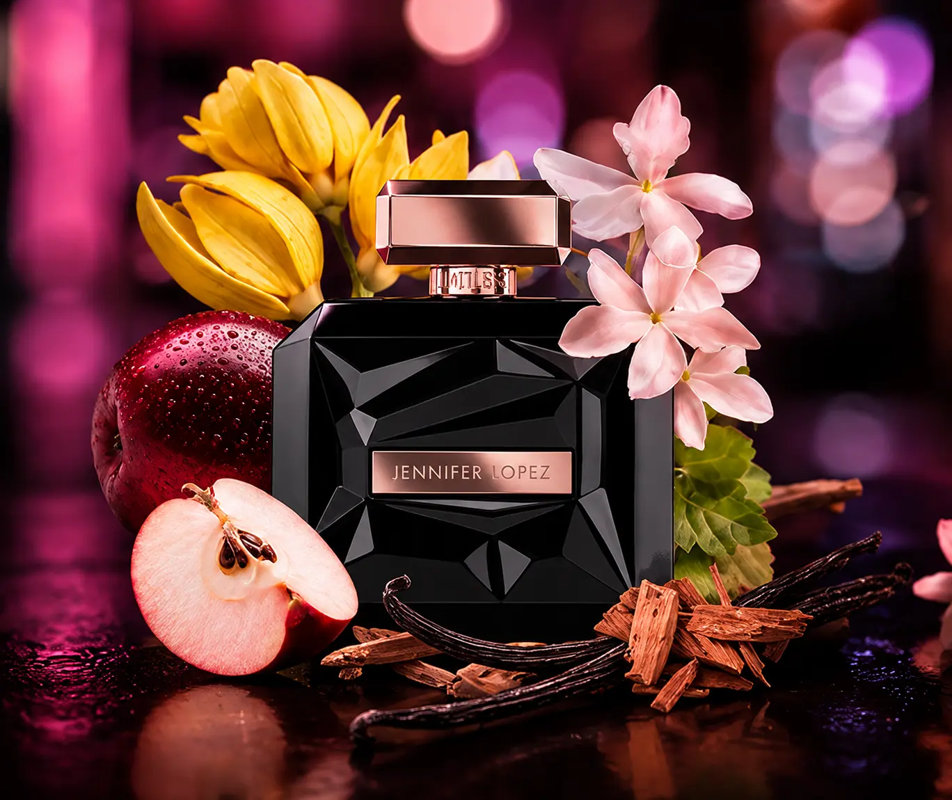
As part of the campaign’s continued development, I have also explored how AI-powered tools can extend and evolve the original visual identity.
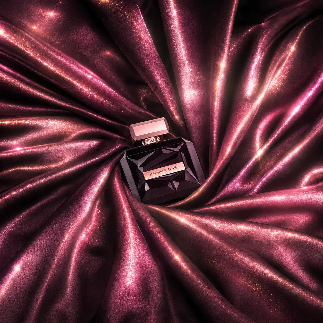
Working alongside my existing Adobe skills, I used AI to experiment with premium environments, lighting, reflections, texture and atmospheric effects, including the pink, and night-out aesthetic, before art-directing and refining the outputs into the established Limitless visual language.
This allowed me to explore new campaign applications quickly while retaining creative control over the brand, product, composition and overall design system.
Social-First Creative, Art Direction & AI-Enhanced Content
01. The Brief
To develop a suite of engaging, social-first creative for Playboy Fragrances, giving each individual fragrance its own distinctive personality while maintaining a recognisable and consistent brand identity across Instagram and wider social channels.
02. Creative Approach
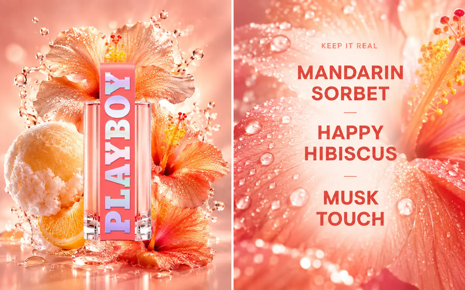
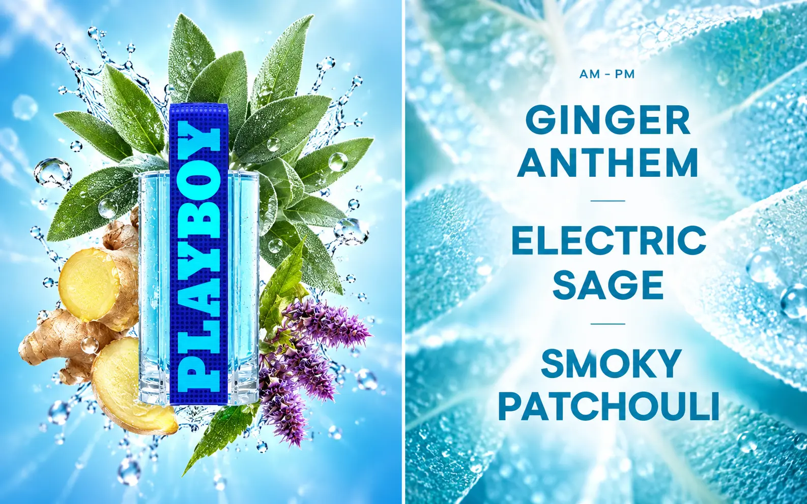
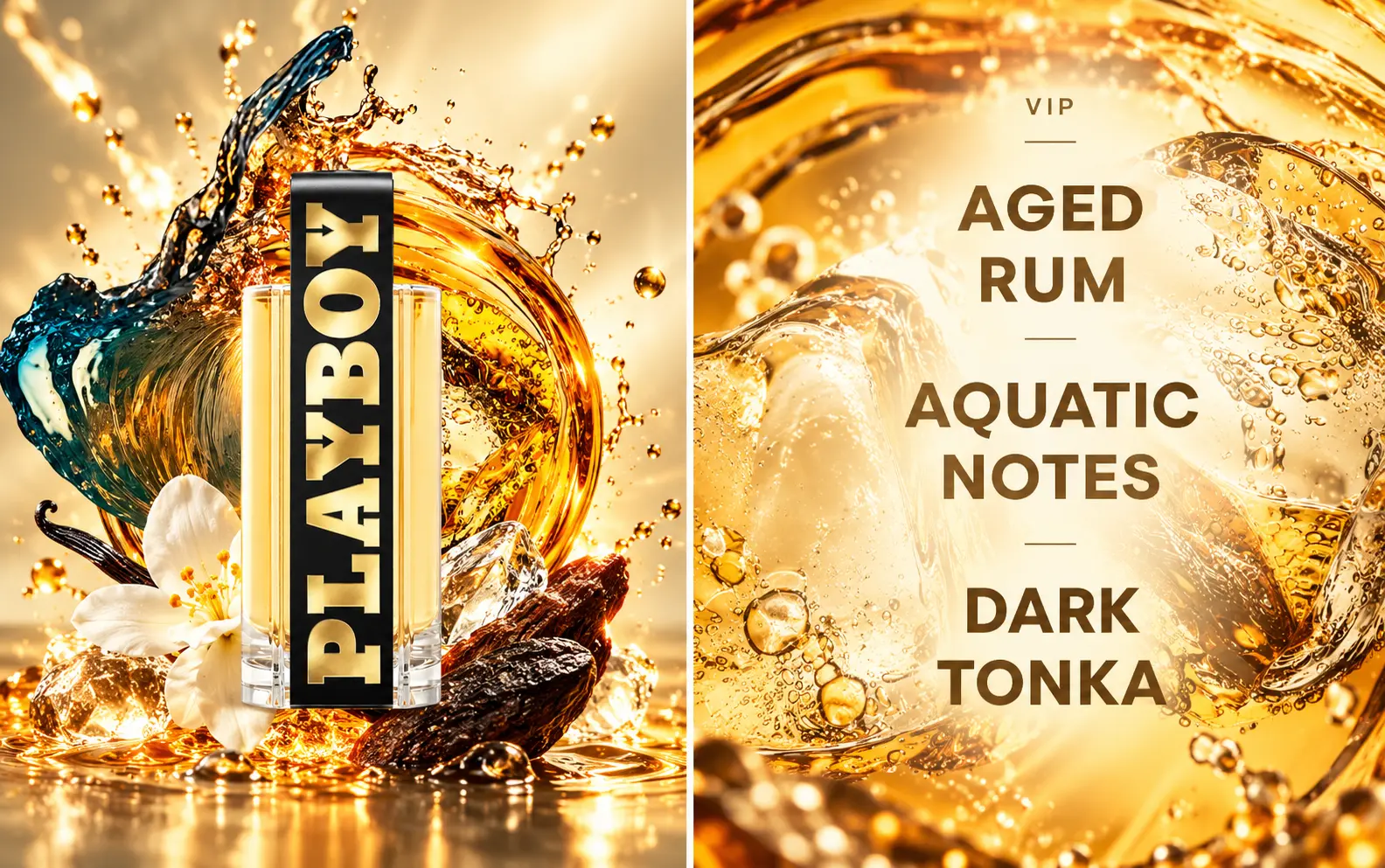
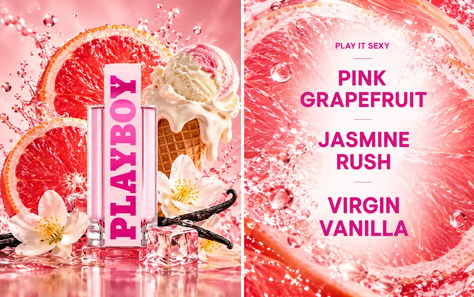
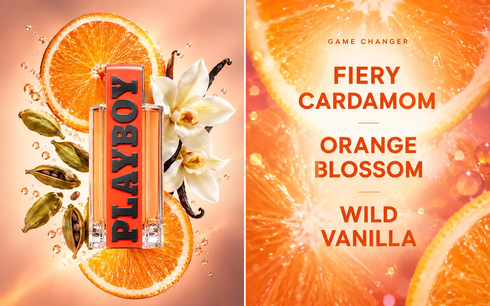
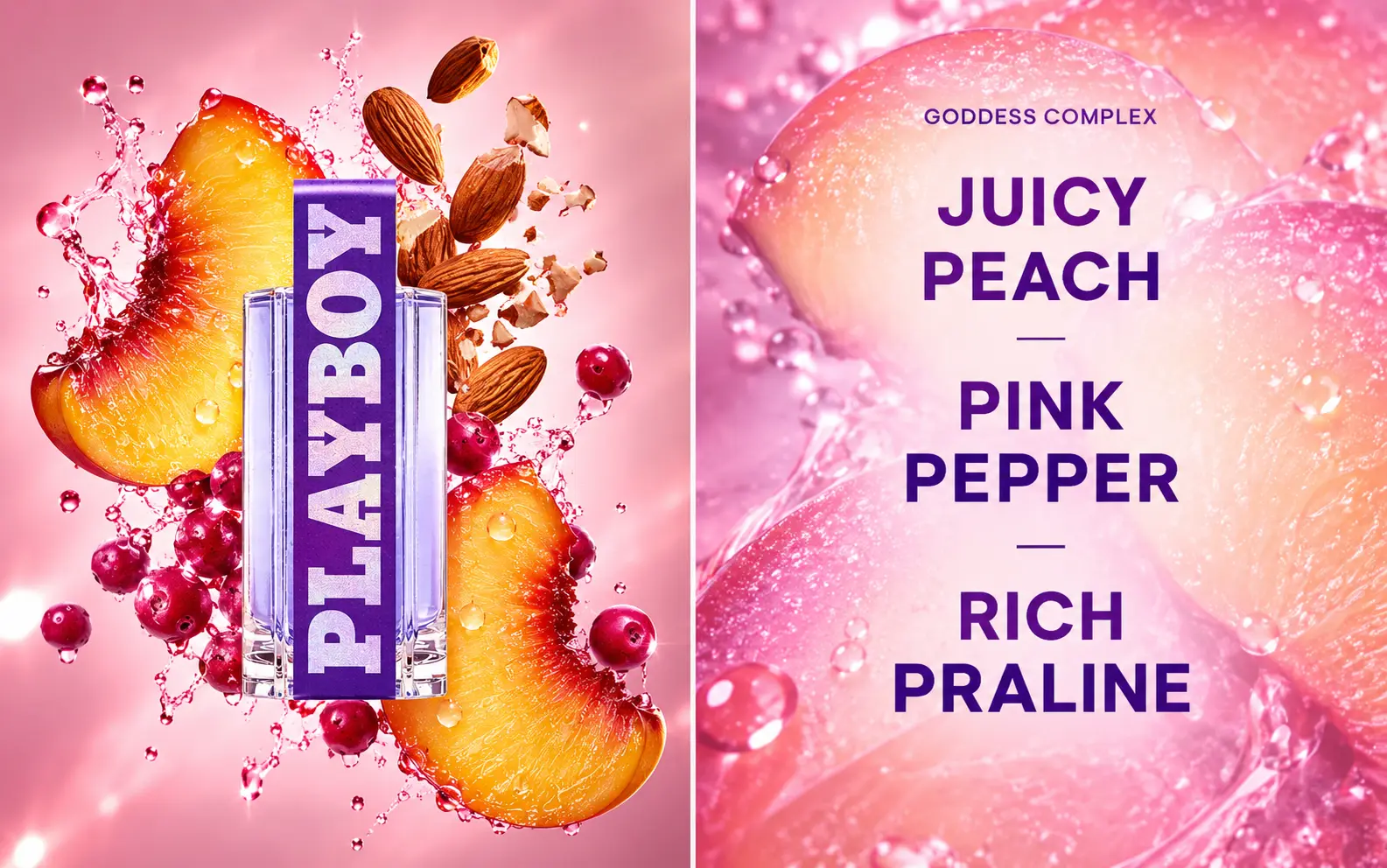
I created a series of individual posts for the different fragrances, developing a unique visual world around the scent profile and fragrance notes of each product.
This approach was carried across the wider fragrance range, using colour, typography, imagery and composition to differentiate each scent while maintaining a consistent Playboy visual language.
03. Adobe Craft + AI-Powered Workflow
The campaign combined my traditional Adobe Photoshop and Illustrator skills with AI-powered image tools. I used AI selectively to enhance and develop the visual representation of fragrance ingredients; exploring more dynamic fruit, textures, lighting, liquid effects and ingredient compositions that would have been difficult or time-consuming to achieve through conventional stock imagery alone.
I then brought these elements back into my Adobe workflow to art direct, composite, retouch, colour-grade and refine the final assets, ensuring that AI supported the creative idea rather than replacing the design process.
04. Designed for Social
The compositions were developed specifically with Instagram and social consumption in mind; using strong colour, bold typography, clear product visibility and exaggerated ingredient imagery to create immediate impact in-feed.
Each fragrance could have its own personality, while the overall system remained recognisably part of the same campaign. This gave the brand a flexible social content system rather than a collection of disconnected posts.
Brand Storytelling, Visual Identity & Campaign Design
01. The Brief
To develop creative that celebrates the distinctive identities within the GHOST fragrance portfolio, while ensuring every execution remained recognisably part of the wider GHOST brand.
Each fragrance has its own personality, audience and scent story, so the challenge was to visually communicate these differences while maintaining the timeless elegance and femininity associated with GHOST.
02. One Brand, Distinctive Identities
A key part of the project was finding the balance between consistency and individuality.
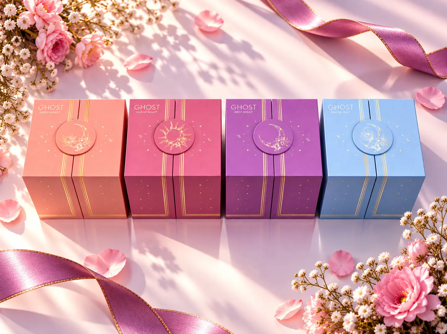
Rather than giving every fragrance an identical treatment, I used the scent profile, packaging and intended mood as the starting point for each creative direction. Consistent design principles then connected the individual executions back to the GHOST masterbrand.
This created a flexible visual system where each fragrance could tell its own story while still feeling part of the same family.
03. Creative Approach
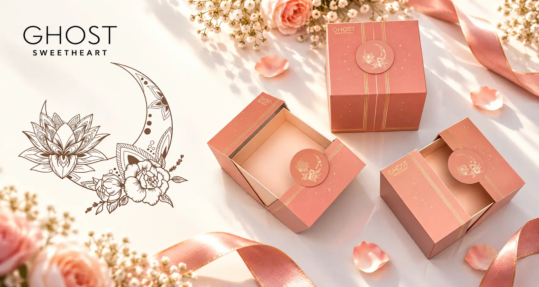
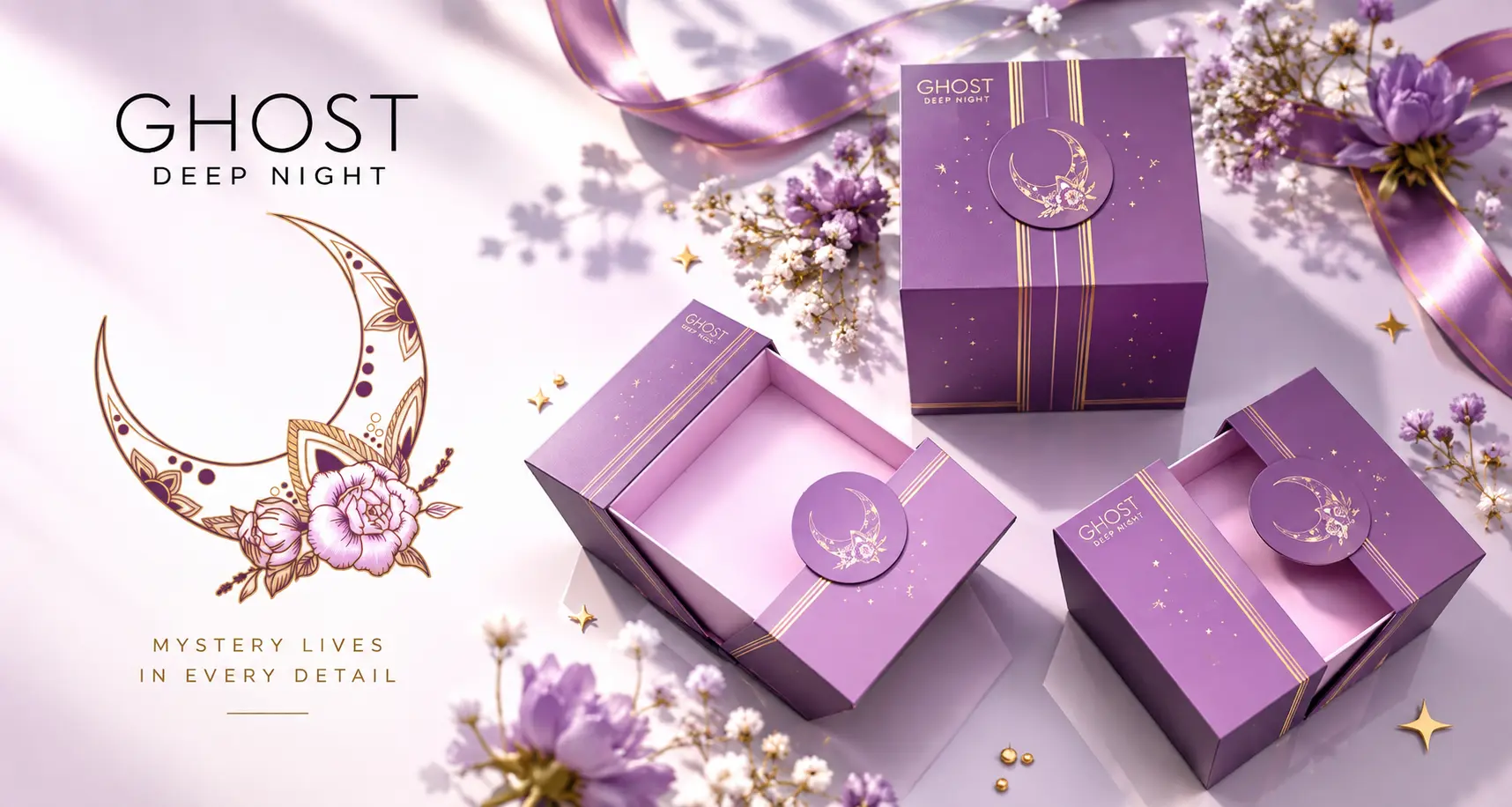
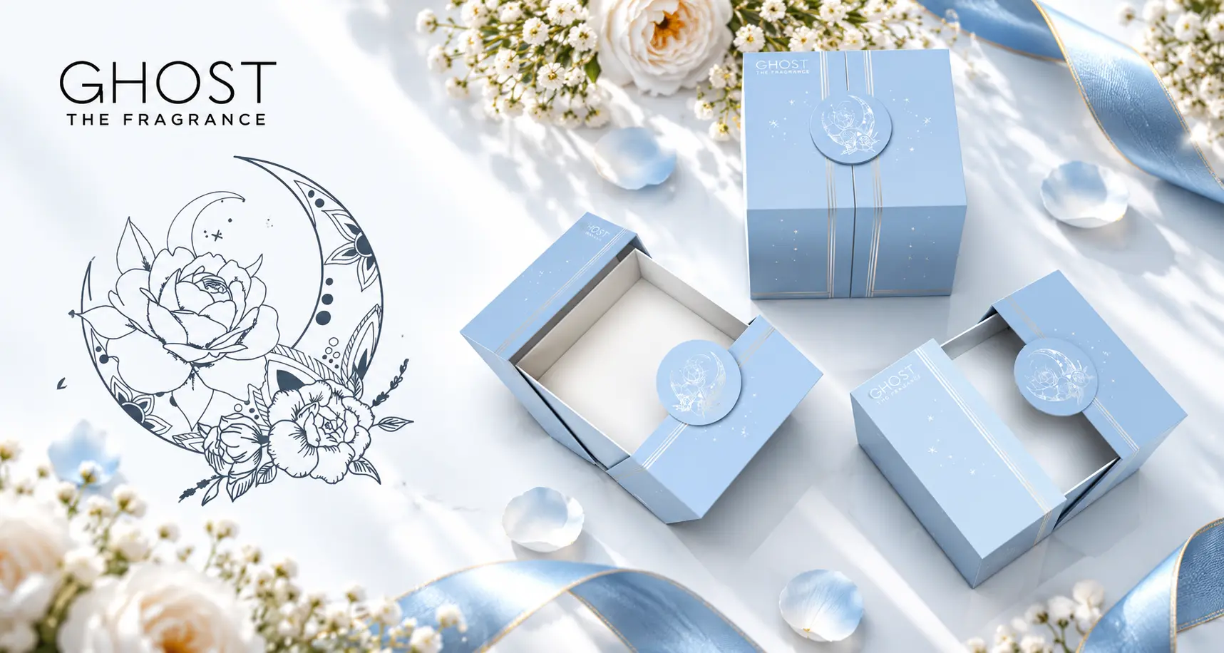
I developed the creative around the individual personality and fragrance notes of each scent, using colour, imagery, composition and atmosphere to create a distinctive visual world for each product.
For GHOST The Fragrance, the direction reflected the softness and romance of rose, jasmine, vanilla and amber, creating an elegant and timeless aesthetic.
GHOST Deep Night required a richer and more atmospheric treatment. Its Indian rose, apricot, vanilla and musk notes informed a deeper, more mysterious visual language, complemented by the fragrance’s iconic purple bottle.
For GHOST Sweetheart, I introduced a lighter and fresher direction to reflect notes of lemon, pineapple, spearmint and white florals, communicating the fragrance’s more youthful and everyday personality.
Concept Development, Illustration & Email Design
01. The Brief
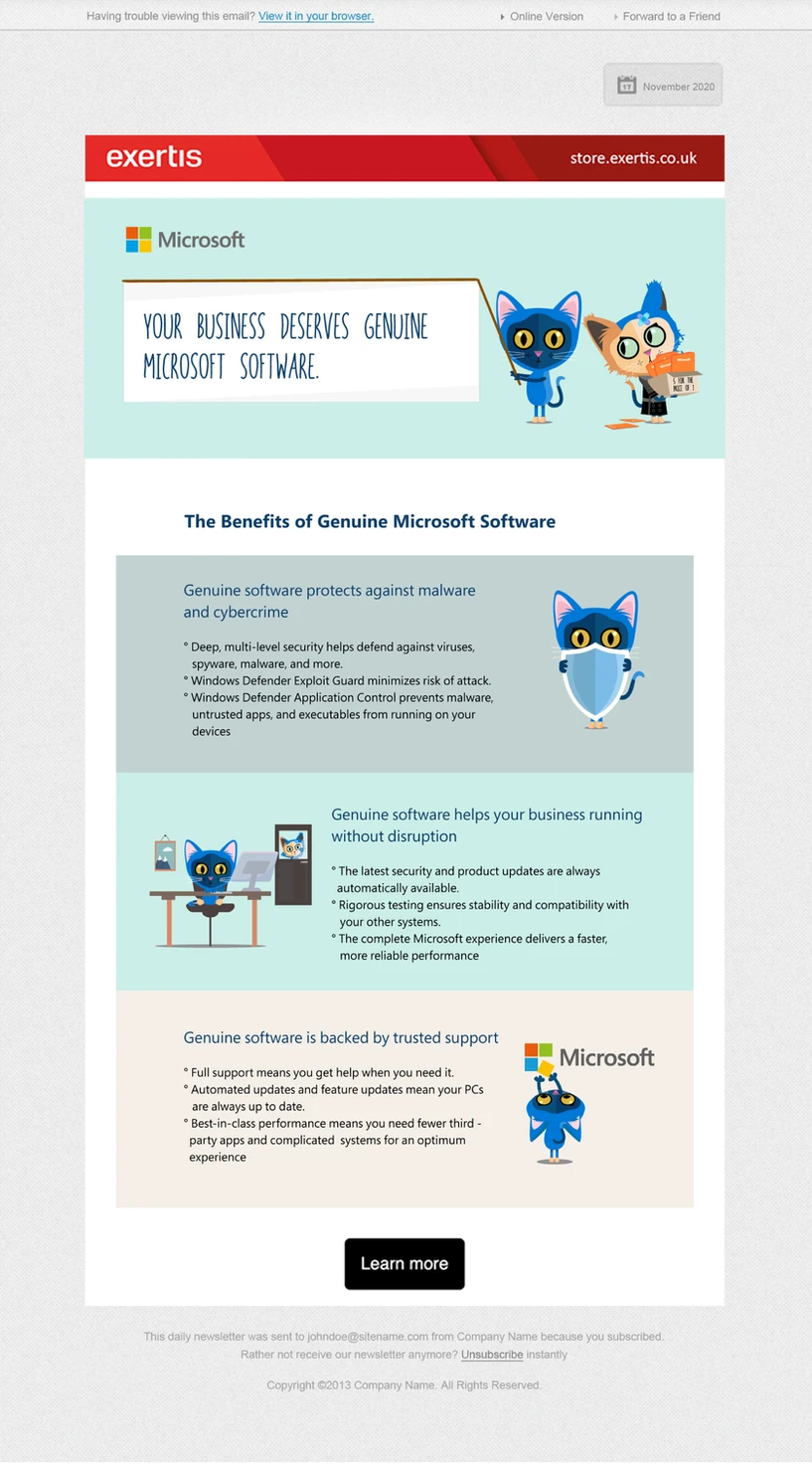
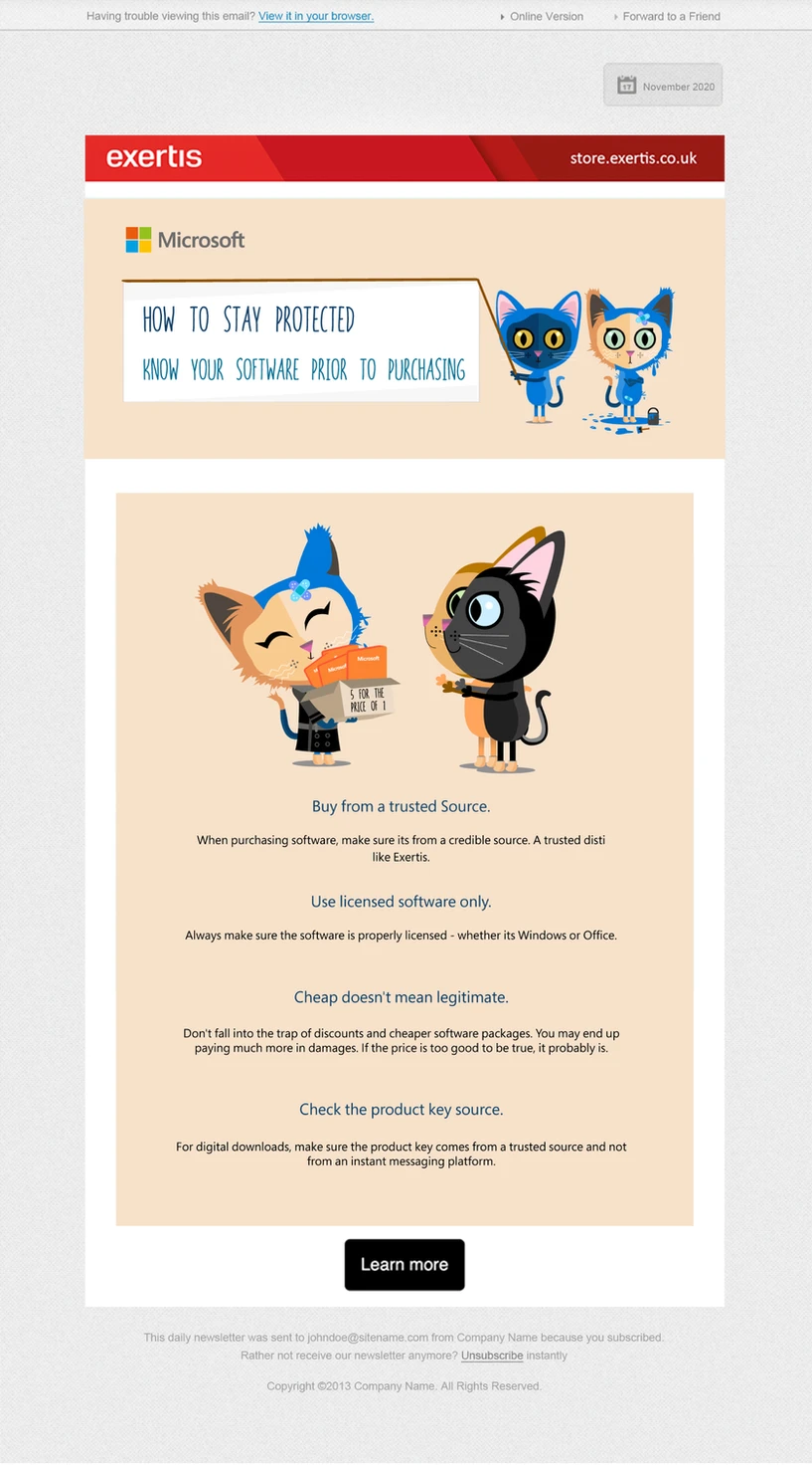
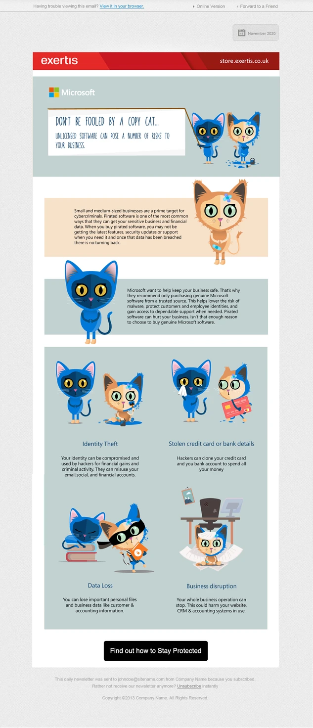
Microsoft required a digital campaign to promote the importance of purchasing genuine Microsoft software, helping customers understand the difference between authentic products and potentially fraudulent or imitation alternatives.
The challenge was to take a technical and potentially complex subject and transform it into a simple, engaging and memorable piece of communication that could be delivered directly to the target audience through email.
Creative Concept
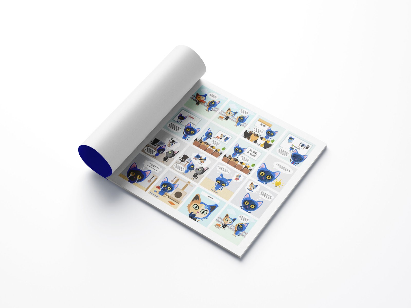
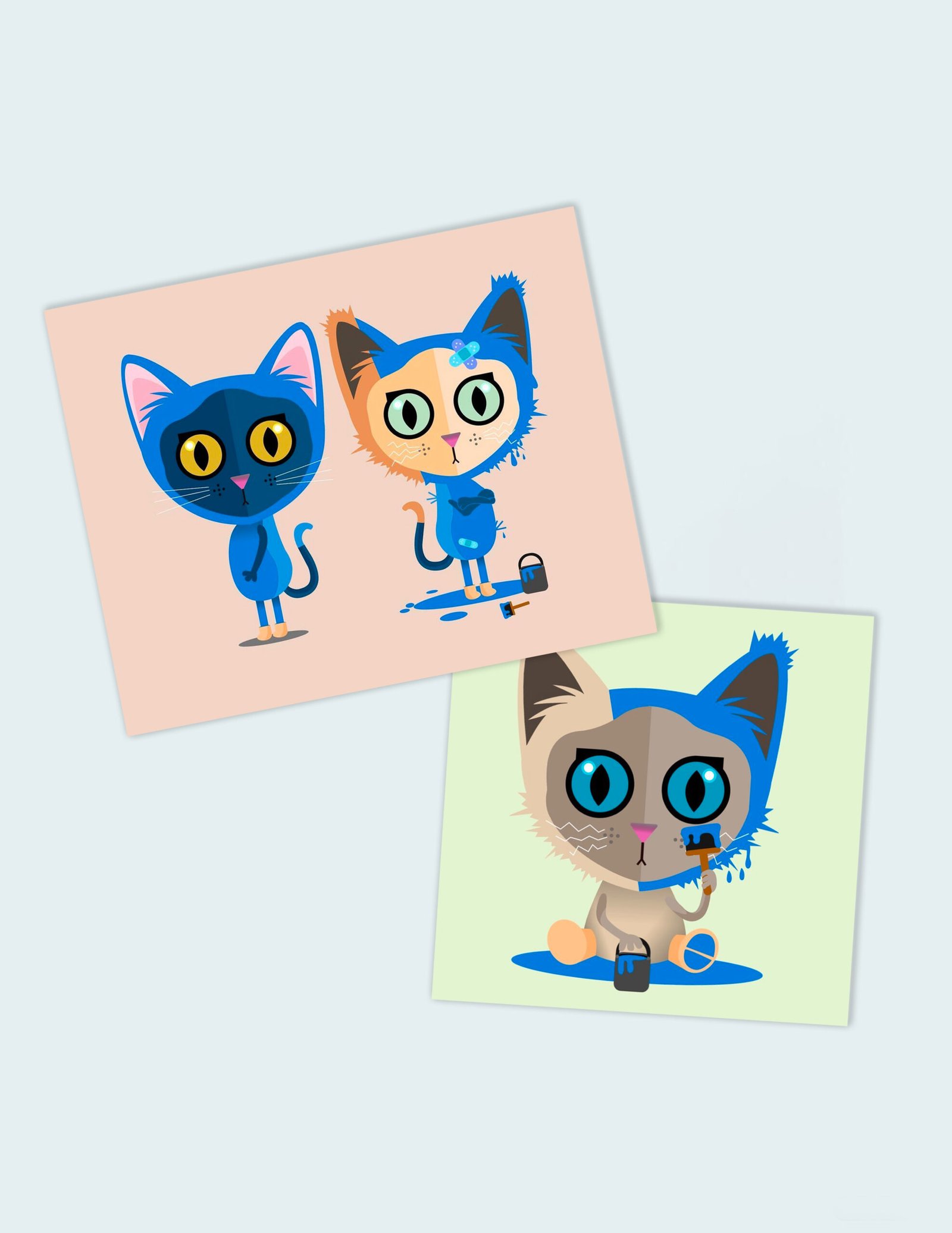
I developed the “Copy Cat” creative concept as a playful visual metaphor for genuine software versus copies and clones.
Rather than communicating the message through technical information alone, I created a series of bespoke Copy Cat illustrations that brought the idea to life in an approachable and instantly recognisable way.
The concept provided a strong visual hook while supporting the underlying campaign message: know the difference, choose genuine Microsoft software.
02. Illustration & Digital Execution
I developed the illustrations and translated the concept into an email campaign, combining character-led imagery, typography, messaging and clear visual hierarchy to guide customers through the communication.
The design needed to capture attention quickly while still feeling appropriate for the Microsoft brand and maintaining a clear route through to the genuine software packages being promoted.
This demonstrated my ability to combine conceptual thinking with hands-on design craft, taking an initial idea through illustration, layout and final digital execution.
Experiential Design, Art Direction & Multi-Brand Exhibition
01. The Brief
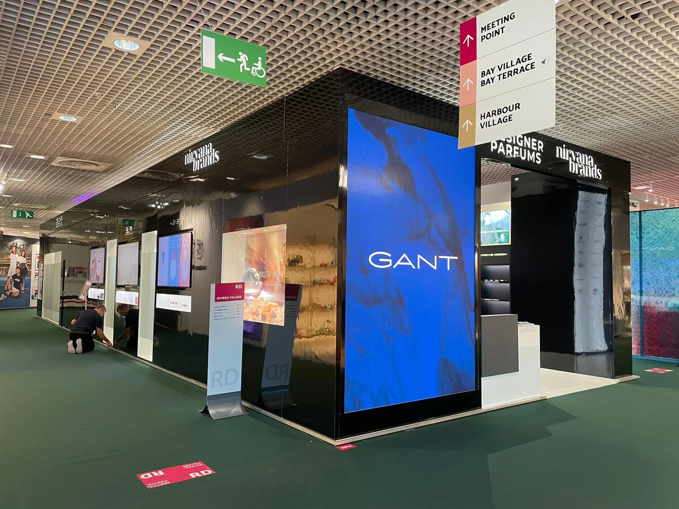
To conceptualise and design the Designer Parfums exhibition stand for TFWA World Exhibition & Conference in Cannes, one of the key events within the international travel retail industry.
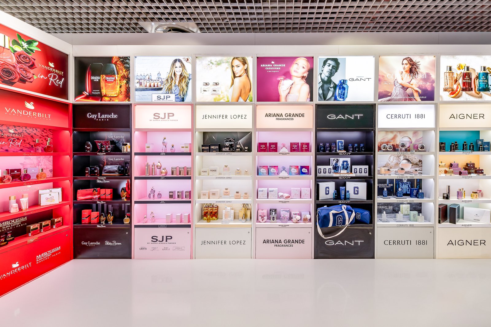
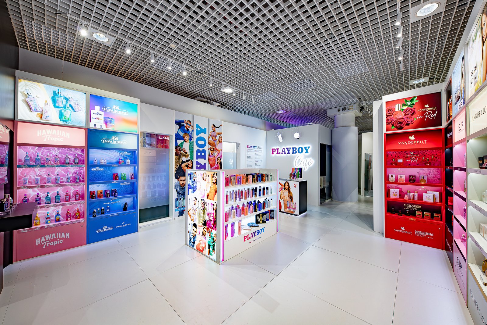
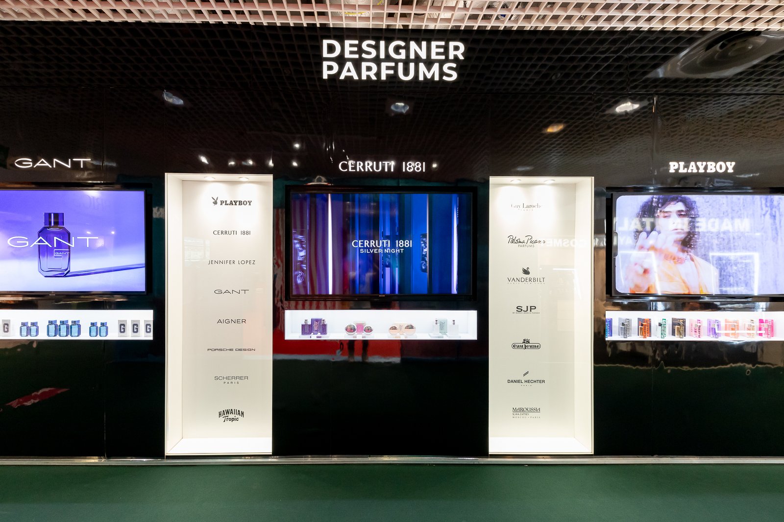
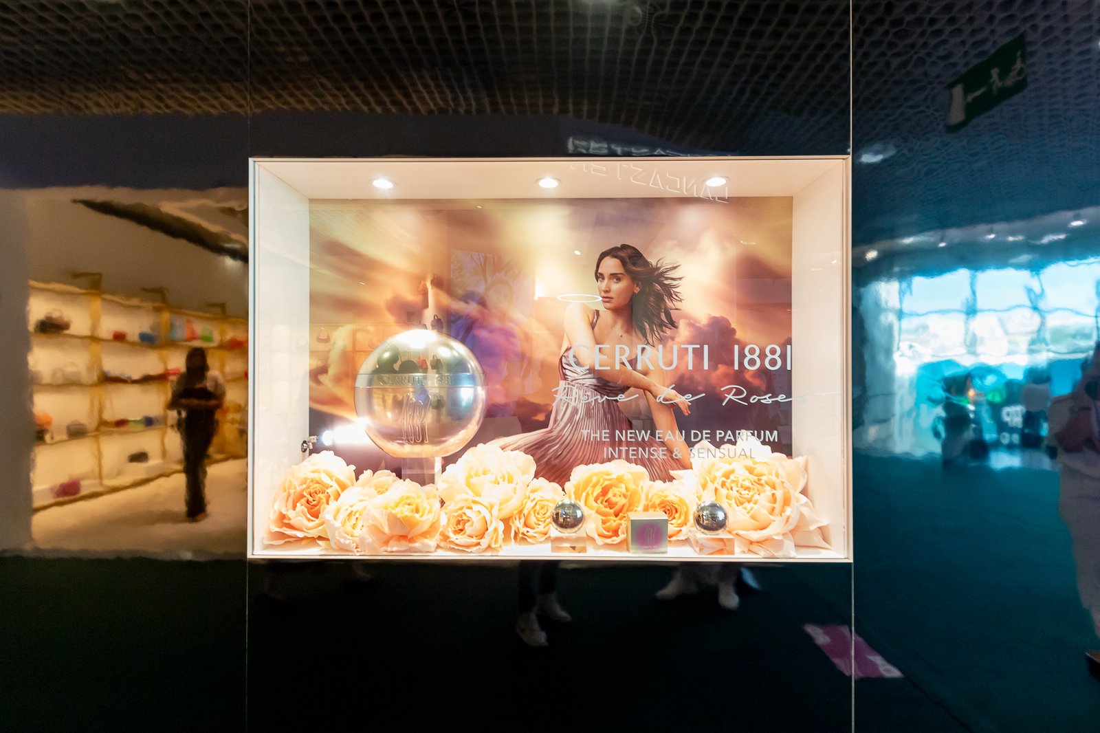
The stand needed to bring together 13 individual fragrance brands, including Ariana Grande, Cerruti, Jennifer Lopez, Porsche Design and Playboy, while giving each brand its own distinctive presence. The commercial objective was to create an engaging environment that would showcase the portfolio, launch new products and attract potential international buyers and business partners.
02. Creative Concept & Art Direction
The challenge was to create a cohesive overall experience while respecting the individual visual identities and brand guidelines of 13 very different brands.
I developed the creative direction for the space and considered the complete customer journey; from the first impression of the exterior through to individual product displays and launch areas within the stand.
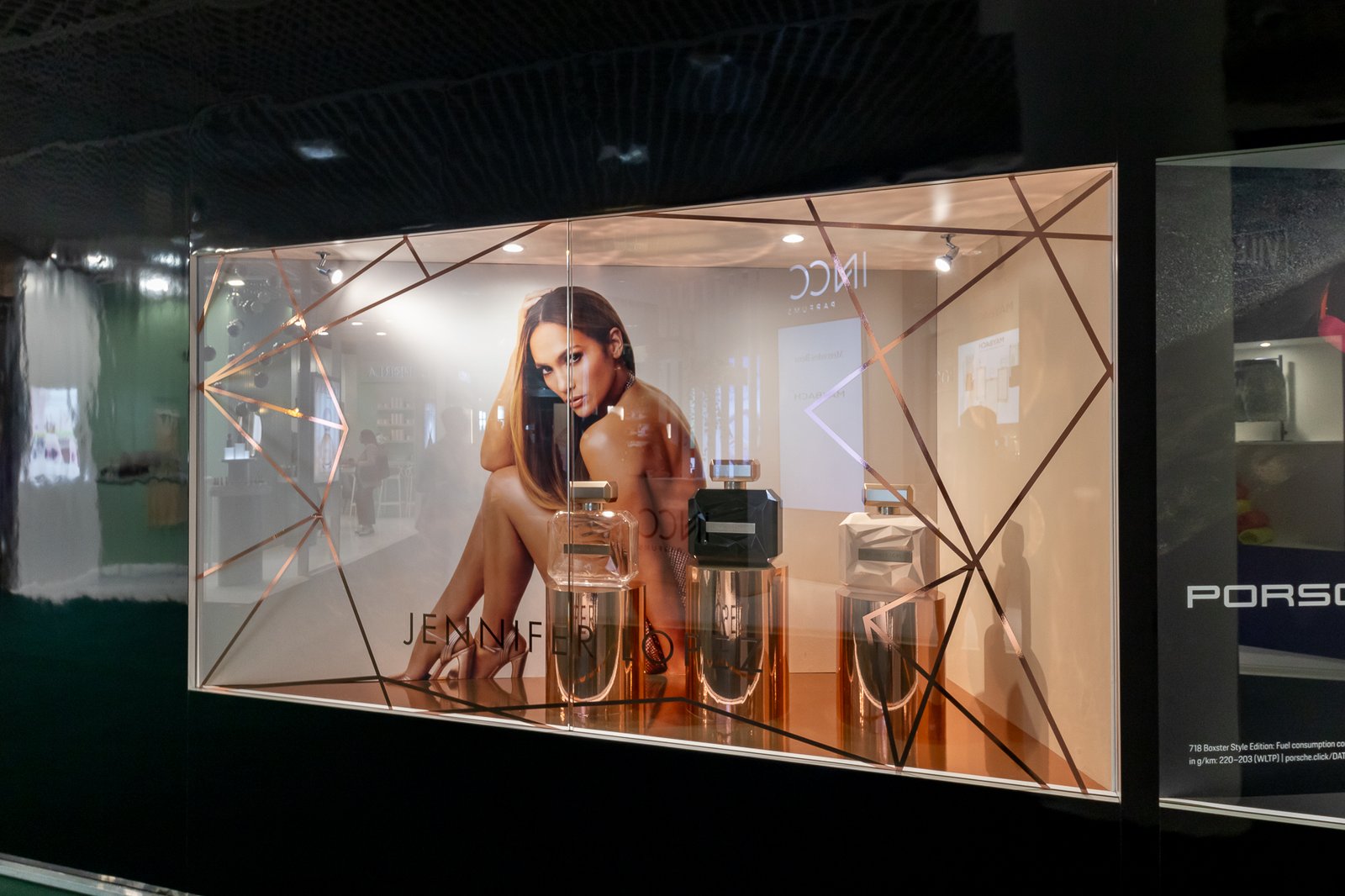
This included creating high-impact window displays for Jennifer Lopez, Cerruti and Porsche Design, alongside 11 individually designed shelving and merchandising units, each tailored to the visual language and positioning of the respective fragrance brand.
03. Creating an Immersive Brand Experience
I considered how physical space, graphics, lighting, digital content and product presentation could work together rather than treating each element in isolation.
Holographic displays were incorporated to showcase new fragrance launches, alongside strategically positioned motion and video content, illuminated lightboxes and branded product displays to create movement and visual interest throughout the environment.
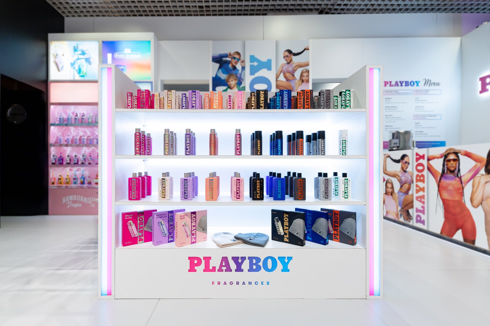
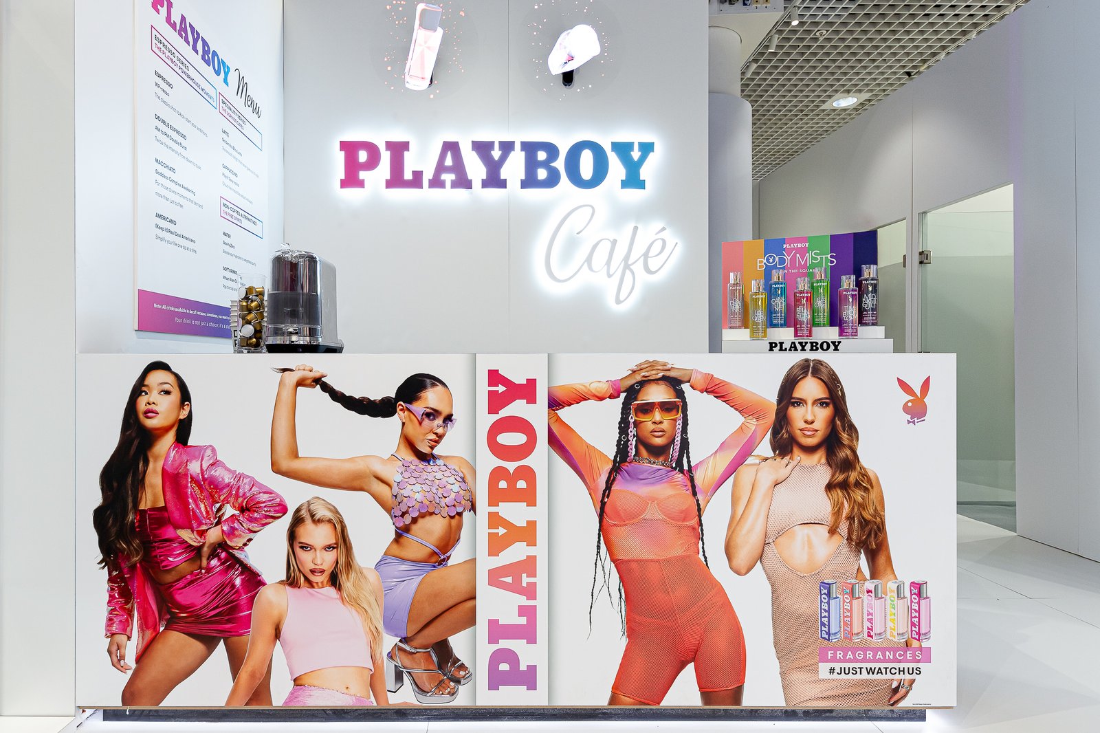
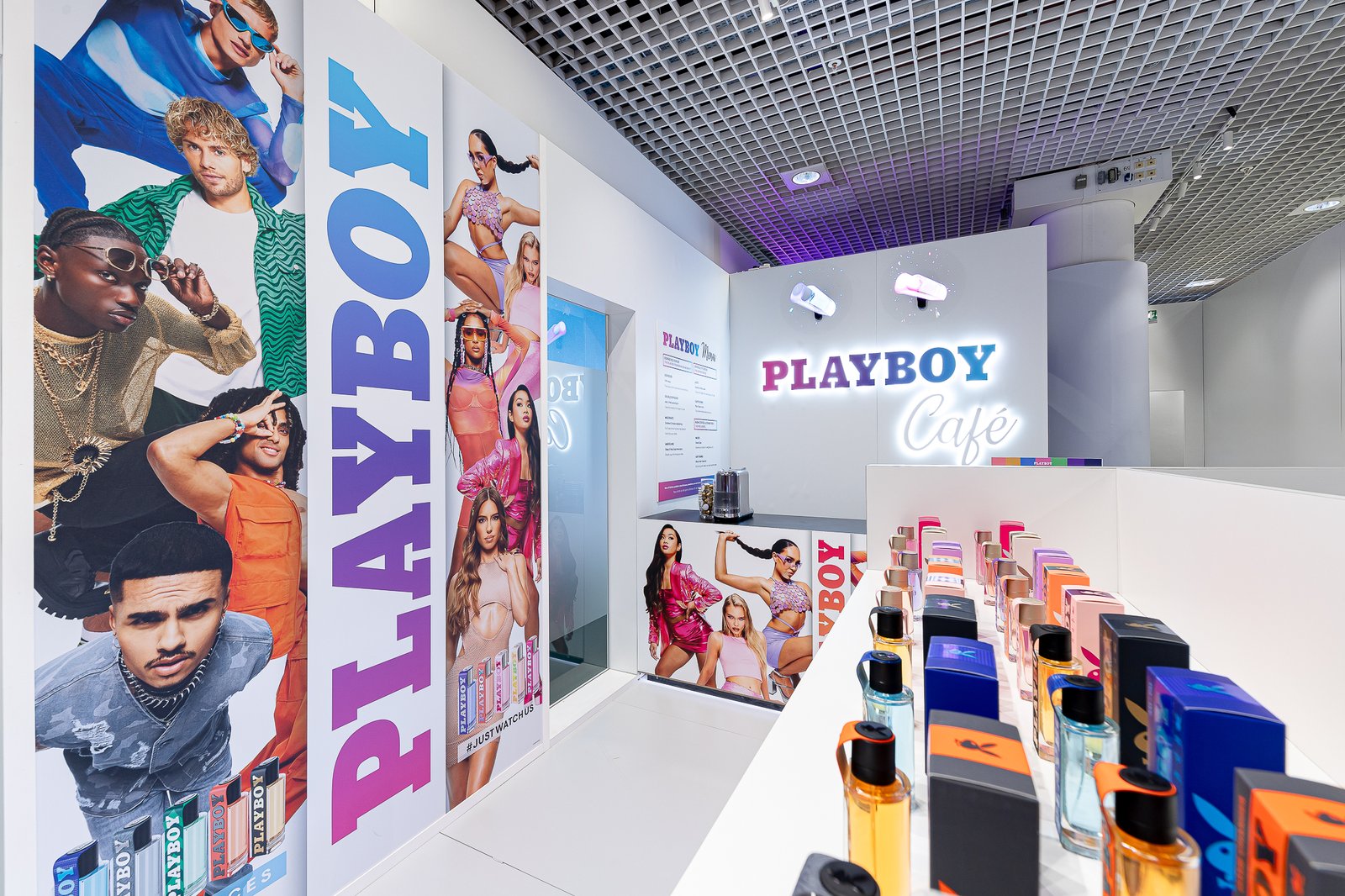
I also developed a dedicated Playboy activation area for the unveiling of its new campaign and fragrance launch, creating a more immersive branded moment within the wider exhibition experience.
04. Integrated Design & Execution
The project required the creative to translate across an unusually broad range of formats, from large-scale environmental graphics and window displays to merchandising units, digital screens, motion content and individual product touchpoints.
Maintaining consistency across the overall stand while simultaneously protecting the identity of each individual brand required careful consideration of hierarchy, layout, imagery, typography, materials and customer flow.